
You’re tracking daily active users, but the number is a rollercoaster. It hides the real story. Are new users sticking around? Are old ones quietly churning? You can’t tell.
This is a massive blind spot. Without clear data, you’re just guessing why people leave. Cohort analysis fixes this. It groups users by sign-up date, showing you who stays, who leaves, and exactly why. This guide shows you how to do it.
Why you need to stop guessing and start using cohort data

Your total user count is a vanity metric. It can’t tell you if product changes or marketing campaigns drive long-term retention. It’s like trying to fix a leaky bucket without knowing where the holes are.
Cohort analysis cuts through that noise. It segments users into groups called "cohorts" based on a shared trait – usually when they signed up.
This lets you ask sharper questions about your business:
- Are users from May more valuable than users from January?
- Did our new onboarding flow improve week 1 retention?
- Which marketing channel brings in users who stick around?
Understanding these patterns is key to sustainable growth. You can diagnose retention problems early and double down on what works. This isn’t just theory – it’s a practical tool to build a product people keep using.
Example
A cohort report shows users from a Google Ads campaign churn twice as fast as users from organic search. That insight immediately impacts your budget. You can now fix the campaign or shift spend to better channels. You can learn more about how to calculate customer acquisition cost in our detailed guide.
The 3 core types of cohorts
Not all cohorts are equal. How you group users determines the questions you can answer. Picking the right approach unlocks real, actionable insights.
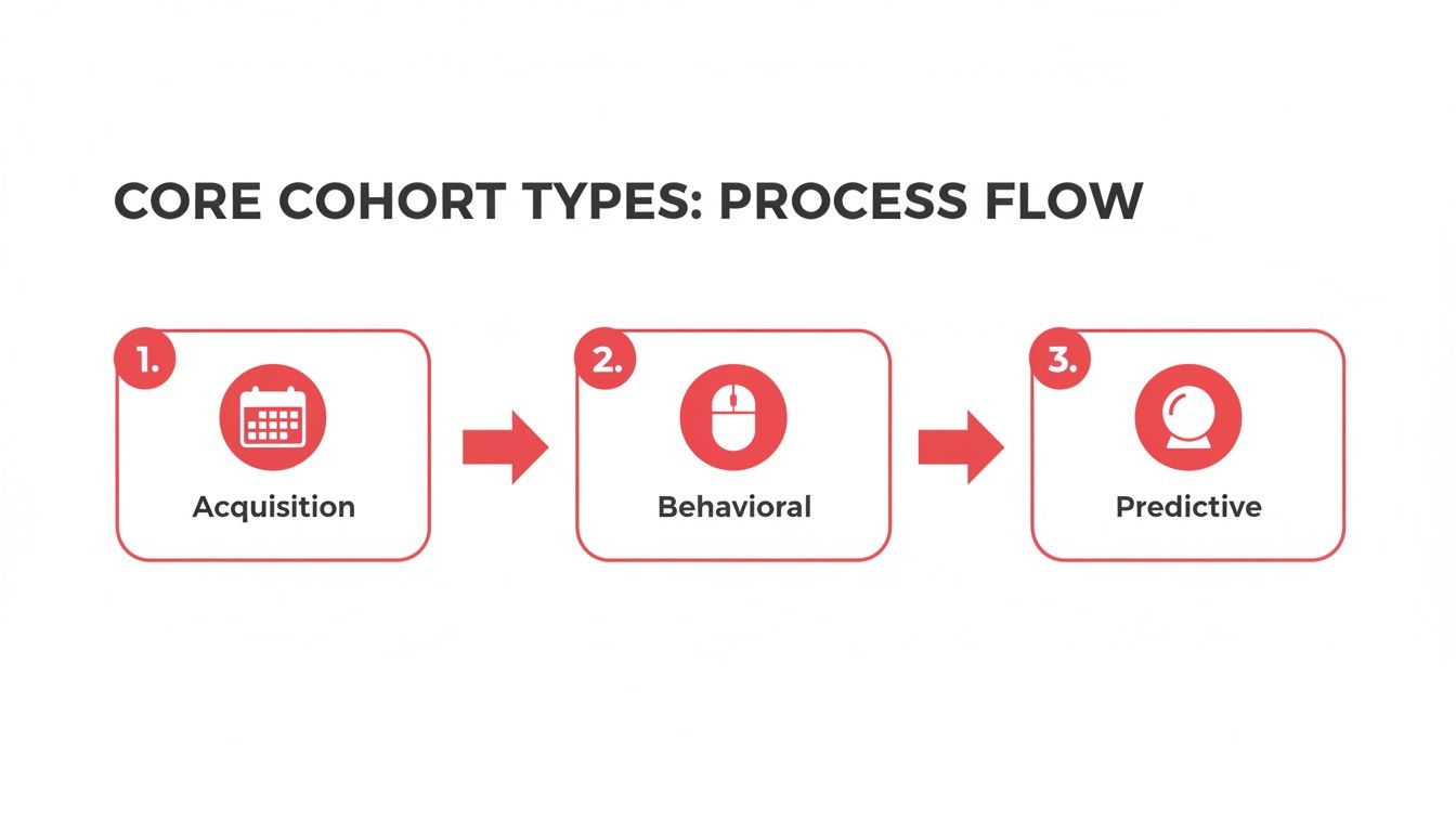
1. Acquisition cohorts
This is the most common starting point. Acquisition cohorts group users by when they signed up – by day, week, or month.
This approach is perfect for answering time-based questions.
- Core question: Are users we got in May sticking around longer than users from March?
- Use case: Measure the impact of marketing campaigns and see if your onboarding is improving.
- What it reveals: It’s the fastest way to see if your product is getting "stickier."
Example
You ran a big marketing push in Q2. By comparing the Q2 cohort to the Q1 cohort, you can see if the new users stuck around at a higher rate. This tells you about the quality of signups, not just the volume.
2. Behavioral cohorts
Behavioral cohorts tell you what users did. These groups are based on specific actions users took within a timeframe.
This helps you isolate the exact actions that correlate with long-term value.
- Core question: Do users who use Feature X in their first week retain better than those who don’t?
- Use case: Identify key actions that turn new users into power users.
- What it reveals: The specific in-product behaviors that create long-term engagement.
Example
Spotify found that users who created a playlist retained 3x longer (65% at month 3) than passive listeners (22%). This insight, covered by Statsig.com, led to UI changes that boosted engagement by 18% globally.
3. Predictive cohorts
This is a more advanced approach. Predictive cohorts use data modeling to group users based on their predicted future behavior.
It helps you get proactive. Spot at-risk users before they leave or identify high-potential users for a VIP experience.
- Core question: Which new trial users are most likely to upgrade next month?
- Use case: Proactively cut churn and personalize marketing offers.
- What it reveals: Hidden opportunities and risks in your user base.
Example
Your model flags a segment of users with a 90% probability of churning. You can automatically enroll this cohort in a re-engagement campaign with a special offer, saving thousands in lost revenue.
How to run your first cohort analysis
Let’s move from theory to action. This guide walks you through building a basic acquisition cohort analysis. You don’t need a fancy BI tool. A spreadsheet is enough to find powerful insights.
Step 1: Define your core question
Every good analysis starts with a sharp question. Don’t just dive into data. Start with what you need to know.
A vague question leads to a vague answer.
- Weak question: "Is retention good?"
- Strong question: "Are users who signed up in May – after our new onboarding launch – retaining better in their first 30 days than users from April?"
For this guide, our question is: How does our monthly user retention change over the first three months?
Step 2: Identify the necessary data points
To answer our question, you need two pieces of information for every user.
- A unique user identifier: A user ID, email, or customer number.
- Activity timestamps: The sign-up date and dates of any later activity (like a login).
This is your foundation. Without a user ID and a timestamp, you can’t group users or track what they do.
The cohort analysis data checklist
| Data Point | Why It’s Critical | Example |
|---|---|---|
| User ID | The unique key to identify and track each user. | user_123, jane.doe@email.com |
| Acquisition Date | The "birth date" of the user. This determines their cohort. | 2024-01-15 10:30:00 UTC |
| Activity Timestamp | A record of every time a user took a key action. | 2024-02-05 08:15:00 UTC |
| Key Action Defined | You must decide what "active" means. A login? A purchase? | "Active means a user logs in at least once per month." |
| Clean Data | Garbage in, garbage out. Use a consistent timestamp format. | All timestamps converted to UTC. |
Step 3: Define cohorts and calculate the metric
Now, group your users. Since our question is about monthly retention, we’ll create monthly acquisition cohorts.
- Users who signed up in January 2024 = The January cohort.
- Users who signed up in February 2024 = The February cohort.
Next, we need our metric: retention rate. The formula is simple:
(# of users in a cohort active in a period) / (Total # of users in that cohort) * 100
For the January cohort’s Month 1 retention, the calculation is:
(# of January signups active in February) / (Total January signups) * 100
Repeat this for each month (Month 1, 2, 3...) for every cohort.
Step 4: Structure your cohort table
A cohort table is the standard way to visualize this data. It’s a grid that makes patterns easy to spot.
- Rows: Each row is a cohort (e.g., January 2024). The first column lists the cohort name and size.
- Columns: The columns represent the user’s age in months (Month 0, Month 1, Month 2). Month 0 is always 100%.
- Cells: Each cell shows the retention rate for a specific cohort at a specific point in time.
This structure lets you read behavior in two directions. Reading across a row shows one cohort’s decay over time. Reading down a column compares different cohorts at the same lifecycle stage.
Example
We made a simple Google Sheets template for cohort analysis you can copy. It has all the formulas pre-built so you can get started right away.
How to read your cohort chart
You’ve built the chart. Now what? Once you know the patterns, that chart tells a powerful story. Look at it from three angles. Each answers a critical question.
1. Read across the rows (user lifecycle)
Read your chart horizontally, row by row. Each row is a single cohort. This view answers one question: How long do users stick around?
Look for the rate of decay. A huge drop-off after month one is a red flag. A gentle, flattening curve suggests you have a core group of loyal users.
- Find the "half-life": At what month do you lose 50% of users?
- Watch the slope: Does the curve ever flatten, or is it a steady decline?
- Spot the loyalists: The point where churn slows down is your loyal user base.
Example
Your "January 2024" cohort starts at 100%. It drops to 45% in Month 1, 30% in Month 2, then levels out around 25%. The initial drop is steep, but anyone who makes it past month two is likely to stay.
2. Scan down the columns (product improvement)
Scan the chart vertically, column by column. Each column represents the same point in every cohort’s lifecycle – like Month 1 retention.
This answers the most important question for a startup: Is our product getting better?
If the numbers in a column trend up, you have proof your changes are making the product stickier. An upward trend proves you are learning and improving your product’s ability to retain users.
Example
Amazon found its older demographic cohorts were more likely to become repeat buyers. In 2020, users aged 35-50 showed a 55% repeat purchase rate within 30 days. Users aged 18-24 were at only 35%.
3. Follow the diagonals (external events)
Look for patterns along the diagonals. This helps you see how specific, one-off events affected all users at the same time.
This view answers: Did a specific event impact everyone at once?
A diagonal line connects cells that correspond to the same calendar month. A sudden spike or dip along a diagonal is almost always tied to an external event.
- Positive spikes: A big PR hit or viral campaign.
- Negative dips: A server outage or a buggy release.
Example
You see a dip across the diagonal for December. Every cohort showed lower activity that month. This could point to a seasonal slowdown or a site-wide bug. This is also critical when you calculate customer lifetime value accurately.
3 common mistakes to avoid in your analysis
Cohort analysis is a powerful tool, but it’s easy to get wrong. A flawed analysis leads to bad decisions. Here are three common pitfalls to sidestep.
1. Using cohorts that are too small
This is the most common error. When your cohort size is tiny, a few random users can create huge percentage swings that mean nothing.
Small cohorts are just noise. Before you make decisions, make sure your cohort size is large enough to provide a stable, meaningful signal.
Example
Your January cohort has 10 users. If two churn, that’s a 20% drop. Your February cohort has 100 users, and 15 churn – a 15% drop. The smaller cohort looks worse, but the bigger one lost more people.
2. Ignoring crucial user segments
Lumping every user into one giant cohort is a mistake. Your "overall" retention might look fine while hiding a fire within a specific user group.
Slice your cohorts deeper to get the real story.
- Free vs. Paid: Paid users almost always retain longer. Mixing them hides the lower retention of your free tier.
- Mobile vs. Desktop: These users often behave differently.
- Organic vs. Paid: A user from a blog post has different intent than someone who clicked a social media ad.
Example
A SaaS company saw a blended Month 1 retention of 40%. When segmented, they found paid users retained at 70%, while free trial users retained at only 10%. The problem was their free-to-paid conversion, not overall retention.
3. Focusing only on retention
Retention is king, but it’s not everything. A user who logs in once a month is "retained," but are they getting value?
This tunnel vision leads you to optimize for the wrong things. You might get people to log in without delivering core value. Pair your retention analysis with other key metrics.
- Engagement: Are users performing key actions?
- Monetization: What is the average revenue per user (ARPU) for each cohort?
- Feature adoption: Are newer cohorts adopting key features faster?
Example
In 2012, Dropbox was tracking its monthly sign-ups. They found that August cohorts, driven by engaged users from summer campaigns, retained at a much steadier 35% compared to January cohorts that dropped from 40% to 20% by day 90.
How to present cohort data in your pitch deck
Investors don’t want your messy spreadsheet. They want a story. A well-presented cohort chart tells a compelling narrative about user love and product stickiness.
Your goal is to give them one powerful takeaway: your ability to keep users is improving over time. This signals a healthy, growing business.
1. Simplify for maximum impact
Your pitch deck is not the place for a dense, number-heavy table. You need a clean, visual chart that tells the story in seconds. A heat-mapped table is perfect for this.
Use a clear color gradient – dark green for high retention, fading to white for lower retention. This allows investors to spot trends instantly.
Focus the chart on one key metric: monthly user retention.
2. Craft the narrative
Build a simple, powerful story around your visual. The most compelling story is one of improving retention.
Use this simple three-part structure:
- State the what: "This chart shows our monthly user retention."
- Highlight the trend: "Our newer cohorts are retaining far better. Month 3 retention has jumped from 15% to 45% in six months."
- Explain the why: "This is a direct result of us shipping Feature X in May, based on user feedback."
This connects data directly to your actions. It shows investors you listen, build, and measure the impact.
3. Design the perfect slide
Your cohort slide should be one of the cleanest in your deck. Find out more about what to include in a pitch deck in our full guide.
Use a layout that works every time:
- A clear title: "Improving retention proves product stickiness"
- The cohort chart: Your clean, heat-mapped table.
- One key takeaway: A bold, one-sentence summary. For example: "Our Month 3 retention has tripled in 6 months due to key product improvements."
Let the slide be simple and focused. This one slide can be more convincing than a dozen slides on market size.
Cohort analysis turns vague metrics into a clear story of growth. It proves your product is getting stickier and shows investors you understand your growth levers.
At Pitchili, we help you translate that data into a pitch deck that gets funded.
