
Your goal is to tell a clear, data-backed story in under 15 slides. You’re not trying to answer every question. You just need to spark enough interest to land the meeting.
You win by nailing a few key things: the problem, your solution, market size, real traction, and a strong team.
What investors actually want in a pitch deck
Forget dense, 50-page business plans. Investors move fast. Their attention is your scarcest resource.
Your pitch deck has one job: communicate a massive opportunity, fast. It’s a compelling story, not a technical manual. It must respect an investor’s time.
The average VC spends just 3 minutes and 44 seconds on a pitch deck. Recent data shows the average seed deck viewing time dropped below 2 minutes in 2023. You can read more about investor viewing habits.
This time crunch changes the game. Investors hunt for signals that de-risk their investment. They scan for answers, not read slide-by-slide.
The investor’s mental checklist
Investors look for a clear narrative built on three pillars:
- A painful problem.
- Early proof of traction.
- A team that’s uniquely equipped to win.
Everything else – your go-to-market plan, your financial model – supports these fundamentals. The flow below shows this hierarchy. Investors start with the problem, look for traction, and then size up the team.
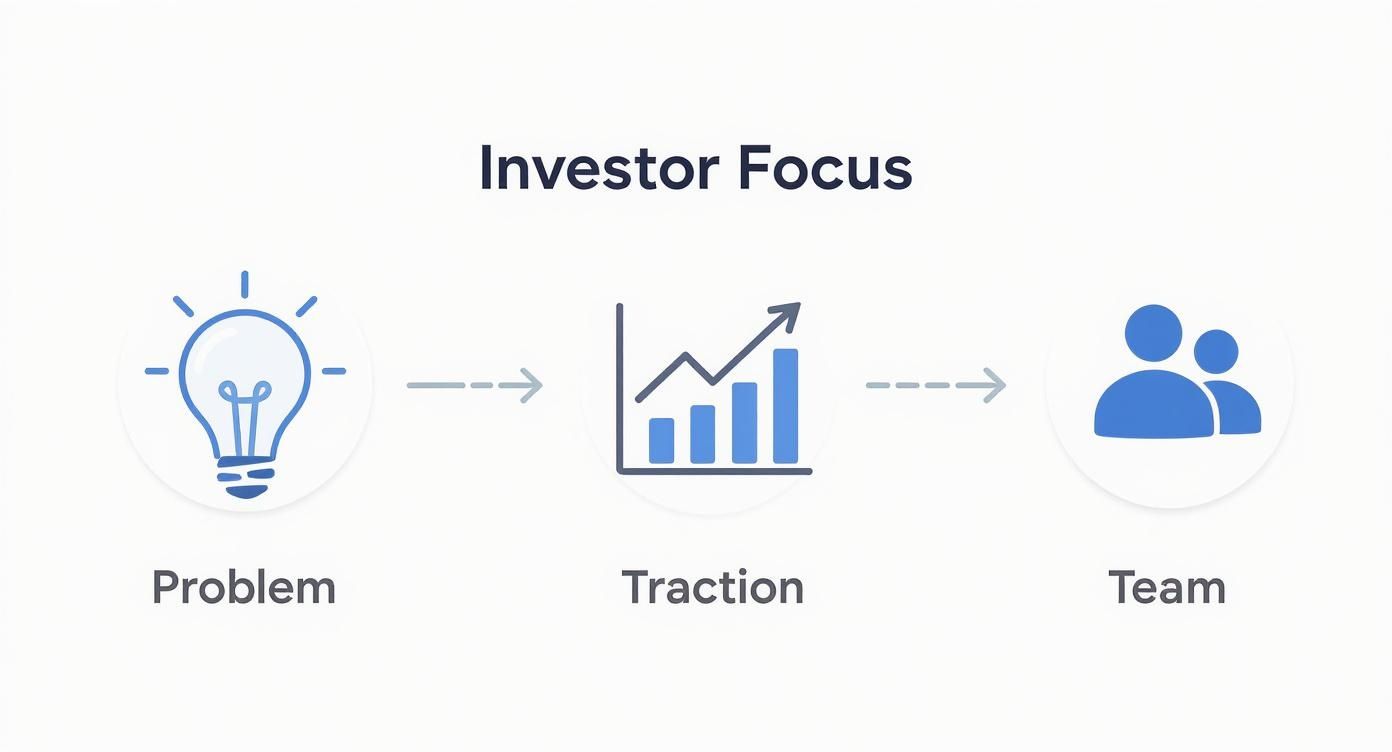
A great idea is just the starting line. Measurable progress and a credible team build the confidence needed to write a check.
What VCs prioritize today
In the current market, investors focus on capital efficiency and a clear path to profit. Your deck must reflect this reality.
Here are the components they look for first:
- A massive, obvious problem. Is the pain a minor inconvenience or a major headache for a huge market?
- Evidence of traction. This is proof you’re onto something. It can be revenue, user growth, sticky metrics, or signed letters of intent.
- A clear business model. How will you make money? Vague statements are a red flag. Show you understand your unit economics.
- An unfair advantage. What’s your moat? This could be proprietary tech, unique data, or deep domain expertise.
Example: An early-stage SaaS startup hooks investors by showing $5k MRR and a 3-month sales cycle, proving both product demand and an efficient go-to-market motion.
Structuring your deck around these elements aligns your story with an investor’s framework. This shift from "here’s what we do" to "here’s what you need to see" gets you the meeting.
Building a narrative that gets funded
Investors don’t fund spreadsheets. They fund stories.
A powerful pitch deck is a logical, compelling story backed by evidence. It walks an investor from a painful problem to your unique solution. It shows a huge market opportunity waiting to be captured.
Your deck should flow like a conversation. Each slide builds on the last. By the end, the only logical conclusion should be that your company is the team to solve this problem.
Forget disjointed data dumps. Build an argument that demands a follow-up meeting.
The opening hook: problem and solution slides
This is your opening act. It needs to land with impact in the first 60 seconds. These two slides establish the "why" behind your startup.
- The problem slide: Start with the pain. Articulate the problem your customer faces. Use relatable language and a powerful statistic.
- The solution slide: Directly address the pain. Present your solution as the clear answer. Explain what you do in a single, crisp sentence.
These slides are critical. For a deeper look, check out our guide on how to build a problem and solution slide that truly hooks investors.
Example:
Weak problem: "The current B2B SaaS procurement process is inefficient."
Strong problem: "Finance teams waste 50+ hours a month manually reconciling software invoices, leading to overspending and compliance risks."
Defining your battlefield: market size and competition
Once you’ve hooked them, investors want to know the opportunity size and who you’re up against.
Don’t use a massive top-down number like "the global software market is $1 trillion." It’s meaningless. Use the TAM, SAM, SOM framework for a credible, bottom-up analysis.
- Total Addressable Market (TAM): The total market demand.
- Serviceable Available Market (SAM): The segment you can serve.
- Serviceable Obtainable Market (SOM): The portion you can realistically capture.
This shows you’ve done your homework. Your competition slide should show how you’re different, not just list competitors. A simple 2×2 matrix is often effective.
Example: Instead of saying you’re in the "$500B advertising market," show your SOM is "$1B for SMBs spending on local search," a market you can actually win.
Showing the magic: product and go-to-market strategy
Now it’s time to show, not just tell. The product slide brings your solution to life. Use clean screenshots, a short GIF, or a workflow diagram. Focus on the "magic moment" – the core feature that makes users' lives better.
The Go-to-Market (GTM) slide answers: how will you get this to customers? Outline your primary acquisition channels – direct sales, content marketing, or partnerships. Show a clear, repeatable plan.
Focus on the 1-2 primary channels you will use to gain initial traction. Investors want to see focus, not a scattered approach.
Example: Your GTM slide might state, "Our initial GTM is content marketing targeting CFOs, with a goal of acquiring the first 100 customers at a CAC of <$500."
Designing for clarity, not just aesthetics
A cluttered deck suggests a messy business. A clean design communicates clarity of thought.
You don’t need to be a design wizard. The goal is to guide the investor’s eye to the most important information. Simplicity is your most powerful tool.
Embrace the "one idea per slide" rule
This is the most common mistake. An investor should grasp a slide’s takeaway in under 10 seconds.
This rule forces discipline. Each slide needs a sharp headline. The headline is supported by a single chart, a few bullet points, or one image. Nothing more.
Simplicity shows you can distill complex ideas into essential parts. VCs value this skill in founders.
Example: A traction slide should have a clear headline like "MRR grew 40% MoM for six straight months" and a simple line chart showing that growth. That’s it.
Establish a clean and consistent visual system
Consistency is the bedrock of professional design. Define a simple visual system and stick to it.
- Typography: Pick one font for headings, another for body text. Use clean sans-serif fonts like Inter or Helvetica. Keep body text at least 18pt.
- Color palette: Stick to 2-3 primary colors. Use one bold color for headlines and a neutral palette for everything else.
- Layout: Use a consistent layout for similar slides. This saves time and ensures the final product looks polished.
If you want to go deeper, our guide on pitch deck design principles has more tips.
Example: Use your primary brand color for all chart lines and headlines. Use a neutral gray for all body text and axis labels. Repeat this on every slide.
Avoid common first-time founder mistakes
Investors spot rookie errors from a mile away.
- Walls of text: Never use paragraphs with more than three lines.
- Low-quality visuals: Use high-resolution logos and screenshots.
- Complicated charts: Use simple bar or line graphs with clear labels.
- Inconsistent branding: Put your logo in the same place on every slide.
Great design gets your story across with maximum clarity.
Example: A bad slide has a long paragraph explaining market trends. A good slide uses a headline like "Market is shifting to on-demand – a $20B opportunity" with one supporting data point from a credible source.
Using data to demonstrate real traction
Traction is the best way to de-risk your startup for an investor. It’s proof that you’re building something people want.
It moves your story from a theoretical idea to a tangible business. Your traction slide should be the most compelling argument in your deck.
Choosing metrics that matter
The numbers that matter most depend on your business model. Presenting the wrong data is a red flag.
For early-stage startups, this doesn’t always have to be revenue. Pre-revenue traction can be just as powerful.
- SaaS: Monthly Recurring Revenue (MRR), Customer Acquisition Cost (CAC), Lifetime Value (LTV), churn rate.
- Marketplaces: Gross Merchandise Volume (GMV), active buyers/sellers, take rate.
- D2C/E-commerce: Revenue growth, average order value (AOV), repeat purchase rate.
- Pre-revenue: User growth, engagement metrics, pilot results, signed letters of intent (LOIs). Evidence that 80% of interviewed customers confirmed a pain point is a strong signal.
Example: A B2B SaaS founder should feature MRR growth as the hero chart. A consumer social app founder should feature Daily Active User (DAU) growth.
Visualizing your data for maximum impact
How you present data is as important as the data itself. The goal is clarity. An investor should grasp the trend in five seconds.
Use simple, clean charts that highlight your upward trajectory. A classic "hockey stick" growth curve is the gold standard.
- Choose the right chart: Use a line chart for growth over time. Use a bar chart to compare values.
- Label everything clearly: Label axes and add a clear title to the chart.
- Focus on one key metric: Your main chart should feature your most important metric.
Don’t just show the rising numbers; briefly explain why. A single bullet point like, "Growth accelerated in Q3 after launching our new integration," adds critical context.
*Example: Below a chart showing a spike in user sign-ups, add a note: "Spike in June driven by our successful Product Hunt launch (achieved #1 product of the day)."*
Key traction metrics by business model
Your traction slide should be clean and impactful. It needs to convey momentum at a glance. Use this table to zero in on what to highlight.
| Business Model | Primary metrics | Secondary metrics |
|---|---|---|
| SaaS | MRR growth, user growth | Churn rate, LTV/CAC ratio |
| Marketplace | GMV growth, # of transactions | Active buyers/sellers, take rate |
| D2C / E-commerce | Revenue growth, # of orders | AOV, repeat purchase rate |
| Pre-revenue | Active user growth, LOIs | Engagement (DAU/MAU), pilot results |
Start with a bold headline like "1,200% YoY growth driven by product-led strategy." Place your primary growth chart front and center. Use 2-3 bullet points for other key wins.
Nailing the ask and your financials
Play videoHow to create a pitch deck investors can't ignore videoThis loads content from YouTube.
You’ve built a compelling story. Now, connect it to a specific funding request. Show investors a credible path to a return.
A vague ask or unbelievable financials is an instant "no." This is about proving you have a realistic plan for growth.
Crafting a clear and confident ask
Your 'ask' slide needs to be direct. Investors need to know how much you’re raising and how you plan to use their capital.
State the number with confidence: "We are raising a $2M seed round to achieve our next 18-month milestones."
The 'use of funds' is the most important part. A simple pie chart or a few bullet points work well.
- Product development (40%): Hire two senior engineers.
- Sales & marketing (35%): Scale paid acquisition channels.
- Hiring & operations (25%): Build out the customer success team.
This breakdown signals you are a disciplined operator.
Example: A startup raising a seed round might show that 70% of the capital will be used for hiring engineering and sales talent – the key drivers of growth for the next stage.
Building defensible financial projections
Investors know your five-year forecast will be wrong. They are testing your assumptions.
They want to see that you understand the levers of your business. Your projections are a test of your financial acumen.
Your projections slide should be a high-level summary. Stick to top-line revenue, key expenses, and profitability over a 3-5 year horizon. A clean table is your best friend.
- Revenue
- Cost of Goods Sold (COGS)
- Gross Profit
- Key Operational Expenses (S&M, R&D)
- EBITDA or Net Profit
Showing these figures annually for the next 3-5 years gives a clear snapshot of your growth trajectory. For a head start, use our guide on building a startup financial projections template.
Example: Instead of showing 36 columns of a monthly P&L, present a simple table with 5 columns showing annual figures for Revenue, Gross Profit, and EBITDA.
The power of key assumptions
This is more important than the numbers. Below your financial summary, list your key assumptions.
This shows your model is grounded in reality. List 3-4 critical assumptions that underpin your model.
- Customer Acquisition Cost (CAC): We assume a CAC of $150, based on initial tests.
- Customer Lifetime Value (LTV): Our model assumes an LTV of $1,200, based on a 5% monthly churn rate.
- Sales team quota: We project each new sales rep will achieve a $600k quota after a 6-month ramp-up.
These assumptions are the bedrock of a defensible financial story.
Example: A D2C startup’s assumptions slide might state: "Our model assumes a 35% repeat purchase rate and an AOV of $85, based on data from our first 1,000 customers."
Ready to build a deck that gets funded? The team at Pitchili blends VC insight with data-driven design to craft winning narratives. Let us help you build your winning pitch deck.
