A logo isn’t just a picture. It’s a strategic asset that communicates your brand in one second. For founders, it’s the first impression for customers, partners, and investors.
Getting it wrong makes you look amateur and forgettable. This is a fatal flaw when you have moments to capture attention. But with so many options, how do you choose the right one?
This guide breaks down 10 core styles of logos. We’ll cover their purpose, pros, and cons. You’ll get a clear framework to select a logo that builds trust and accelerates recognition.
1. Wordmark / logotype
A wordmark is a logo built entirely from the company’s name. It uses custom typography as the main visual. The name is the logo.
Think of Google, Coca-Cola, or Netflix. Their names are instantly recognizable because of their unique styling. The font and spacing create a memorable brand identity.
Why choose a wordmark?
This style works well for new companies with a unique name. It directly builds name recognition. It’s clean, timeless, and translates well across all media. It cuts through visual noise and focuses on your brand’s name.
Key considerations:
- Use custom typography. A standard font looks generic. Invest in custom lettering to make your logo unique and ownable.
- Prioritize legibility. Your logo must be readable at all sizes, from a tiny favicon to a billboard.
- Reflect brand personality. The font should match your brand’s core traits. A sleek sans-serif fits a tech startup. An elegant script works for a luxury brand.
Example: Visa. The simple, bold, and italicized wordmark suggests speed and trust. Its clean typography makes it recognizable worldwide.
Before work starts, give your designer a solid brief. A strong brief aligns the design with your vision. You can learn how to create a design brief on pitchili.com.
2. Pictorial mark / icon logo
A pictorial mark is a logo that uses a single graphic image. The icon is usually a simplified, literal representation of an object or concept. It creates a powerful brand symbol through visual association.

Think of Apple’s logo, Twitter’s bird, or Target’s bullseye. These images are so iconic that they identify the company without any text. This immediate recognition is the goal.
Why choose a pictorial mark?
This style is great for established brands seeking global reach. Images cross language barriers. A strong icon is memorable and works well on everything from app icons to merchandise.
Key considerations:
- Ensure brand relevance. The image must connect to your brand’s name, service, or mission. An irrelevant icon causes confusion.
- Aim for simplicity. The best pictorial marks are clean and easy to recognize. The design must be unique and stand out.
- Test for scalability. Your logo must work as a tiny app icon and a large sign. Test its clarity in a single color.
Example: Apple. The bitten apple is simple, globally recognized, and directly tied to the company name.
3. Abstract mark / geometric logo
An abstract mark is a logo made from a custom geometric shape. It doesn’t represent a real object. Instead, it uses design principles to build a unique visual identity linked to the company’s values.
Think of the Nike "Swoosh" or the Adidas three stripes. These symbols don’t show shoes. They evoke feelings like movement and performance, which are now inseparable from the brands.
Why choose an abstract mark?
This style is perfect for global brands as it bypasses language barriers. An abstract symbol is unique and hard to copy. It distills complex ideas into a simple, memorable form.
Key considerations:
- Connect form to brand values. The shape should connect to your mission. An upward-moving shape can suggest growth.
- Prioritize simplicity. A clean geometric form is more versatile and timeless than a complex one.
- Test in a single color. A strong abstract mark must work in one color to ensure it works everywhere.
- Build meaning over time. An abstract mark requires consistent marketing to associate the symbol with your brand’s story.
Example: Nike. The "Swoosh" is a simple, abstract shape that powerfully communicates speed, movement, and victory.
4. Mascot logo
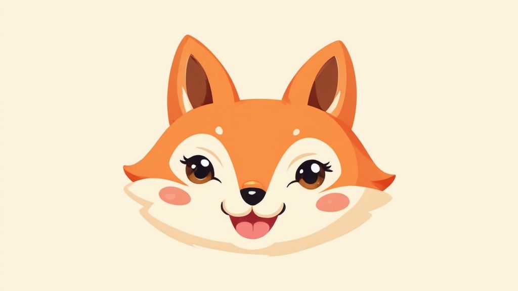
A mascot logo uses an illustrated character as the brand’s ambassador. This style creates a strong emotional connection with the audience. The character becomes a memorable asset.
Think of the Kool-Aid Man or the Geico Gecko. These characters embody the brand’s personality. They are powerful marketing tools, especially for families and younger audiences.
Why choose a mascot?
Mascots are great for storytelling and engaging customers. They are flexible and can be adapted for different marketing campaigns. This style is ideal for brands wanting a fun or family-friendly image.
Key considerations:
- Develop a character persona. Your mascot needs a personality. Define its traits, backstory, and voice to ensure it represents your brand.
- Ensure versatility. The character must work across multiple platforms and sizes. Test its appearance from a small app icon to an animation.
- Test audience appeal. Get feedback from your target audience before finalizing the design. A character that resonates poorly is a liability.
Example: Duolingo. The green owl, Duo, is friendly, encouraging, and instantly recognizable, making the language-learning experience feel more personal.
5. Combination mark / emblem logo
A combination mark pairs a wordmark with a symbol (pictorial, abstract, or mascot). This popular style combines text and an image into one cohesive logo.
Consider Lacoste’s crocodile and text, or Puma’s leaping cat and name. The image and text can be side-by-side, stacked, or integrated. This provides both a literal and symbolic view of the brand.
Why choose a combination mark?
This style offers the best of both worlds. You get the name recognition of a wordmark and the visual appeal of a symbol. The separate elements also provide flexibility. The symbol can stand alone as a favicon.
Key considerations:
- Create a unified design. The text and image must complement each other in style, weight, and proportion.
- Design for scalability. Both the symbol and wordmark must be clear when scaled down for a mobile app or enlarged for a billboard.
- Ensure elements can stand alone. The individual parts should be strong enough to represent the brand independently when needed.
Example: Spotify. The combination of its clean wordmark and the distinct three-lined soundwave icon is versatile and instantly recognizable.
See a design brief example on pitchili.com to understand how to articulate these requirements.
6. Monogram / letter logo
A monogram is a typography-based logo made of a company’s initials. This classic style distills a brand identity down to its simplest alphabetic form.
Think of Louis Vuitton (LV) or Chanel (interlocking Cs). Their monograms are symbols of legacy and quality. This style is powerful because it’s both personal and concise.
Why choose a monogram?
This style is a perfect fit for brands with long names. It creates a compact and easily recognizable identifier. It projects a sense of history, luxury, or personal service. Monograms are sophisticated and scalable.
Key considerations:
- Balance and symmetry are crucial. The arrangement of letters must feel harmonious and stable.
- Limit the letters. The best monograms use two to four initials. More becomes cluttered and hard to read.
- Ensure legibility at any scale. The logo must be clear when scaled down to a tiny app icon or embroidered on a product.
Example: IBM. The three letters are simple, strong, and have represented technological authority for decades.
7. Negative space logo
A negative space logo cleverly uses the background or empty space to create a second image. This style creates a visual puzzle that rewards the viewer’s attention.
The classic example is the FedEx logo, with its hidden arrow between the 'E' and 'x'. The arrow represents forward movement and exists only in the negative space.
Why choose a negative space logo?
This is one of the most intelligent styles of logos. It’s perfect for brands that want to convey cleverness or depth. The "aha moment" of discovery creates a memorable connection with the brand.
Key considerations:
- Create an 'aha moment.' The hidden element should be subtle but clear enough to be understood once seen.
- Balance is essential. Both the positive (main shape) and negative (hidden shape) elements must be strong and recognizable.
- Test for clarity. The logo must work even if the viewer never spots the hidden image. Don’t sacrifice clarity for cleverness.
Example: FedEx. The hidden arrow is a masterclass in design, subtly communicating speed and precision without a single extra line.
8. Gradient / multi-color logo
A gradient logo uses smooth color transitions as a core part of its identity. The blend of hues creates depth, energy, and a modern feel.
Think of Instagram’s camera, which uses a vibrant sunset gradient. The gradient makes the brand feel dynamic, innovative, and digital-first. It captures attention in a crowded digital world.
Why choose a gradient logo?
This style is excellent for tech companies and startups. It can make a simple shape feel more sophisticated. It is especially effective on digital screens where colors are vibrant.
Key considerations:
- Ensure purposeful color. The gradient should enhance your brand story, not just be decoration.
- Test for versatility. Your logo must remain recognizable in a single-color or grayscale version.
- Prioritize digital-first design. Gradients shine on screens but can be hard to reproduce in print.
- Maintain legibility. When using a gradient on text, ensure the color transitions don’t hurt readability.
Example: Instagram. The warm, vibrant gradient suggests creativity, connection, and the capture of colorful life moments.
9. Responsive / adaptive logo
A responsive logo is a flexible system designed to change based on context and screen size. It ensures brand consistency across all applications, from a billboard to a favicon.
The system uses several logo variations, from complex to extremely simple. This maintains brand recognition without sacrificing clarity. Data shows that 85% of adults think a company’s mobile website should be as good as or better than its desktop version ([Kommand], 2024), making adaptive logos critical.
Why choose a responsive logo?
In a multi-device world, this style is essential for a consistent brand presence. It ensures your logo is always legible and optimized. This approach future-proofs your brand identity.
Key considerations:
- Design a modular system. Start with the most detailed version of your logo. Systematically remove elements to create simpler variations.
- Establish clear usage guidelines. Your brand guide must specify when and where each version should be used.
- Test across all applications. Test every logo variation in its intended context-on different devices, social media, and print.
- Prioritize the icon. Ensure the most simplified version is instantly recognizable on its own.
Example: Spotify. The full wordmark appears on large screens, but it simplifies to the iconic soundwave symbol for small spaces like app icons.
The principles of responsive logos are tied to broader design strategies. You can learn more by exploring user experience design services on pitchili.com.
10. Vintage / retro logo
A vintage logo draws on the style of past decades to create a sense of nostalgia and quality. It uses historical design elements, typography, and color palettes from specific eras.
Think of the Stranger Things title sequence or the brand Shinola. These logos use a retro aesthetic to evoke heritage. They tap into cultural memory to build an immediate emotional connection.
Why choose a vintage/retro logo?
This approach works for brands aiming to project history or craftsmanship. It can make a new company feel established and trustworthy. A retro logo tells a story and helps a brand stand out.
- Choose a specific era. Research and commit to a particular design movement, like Art Deco or Mid-Century Modern.
- Balance with modernity. The biggest risk is looking dated. Modernize retro elements with clean lines and contemporary colors.
- Prioritize quality execution. Vintage styles often have intricate details. High-quality design is critical to avoid looking cheap.
Example: NASA. The iconic "worm" logotype from 1975, recently revived, uses a retro-futuristic style that feels both nostalgic and forward-thinking.
Your logo style selection checklist
Choosing the right logo is a strategic decision. Use this checklist to score each style from 1 (poor fit) to 5 (perfect fit) based on how well it aligns with your startup.
- Brand personality
Is your brand modern and sleek, or traditional and trustworthy? Whimsical or serious? (e.g., Mascots for friendly brands, monograms for established ones). - Target audience
Who are you trying to reach? A minimal abstract mark might resonate with a tech-savvy audience, while a vintage logo could appeal to customers seeking authenticity. - Company name
Is your name short and memorable (like Google’s wordmark)? A long name might benefit from a monogram to simplify it. - Scalability
Where will your logo live? It needs to work on a tiny favicon and a large banner. Responsive and combination marks offer maximum flexibility. - Industry context
What are the conventions in your space? Sometimes it pays to stand out, but other times, aligning with industry norms builds immediate trust.
This framework helps you make an informed decision that connects your brand’s look to its strategy.
Your logo is more than a design-it’s your company’s signature. Make it count.
A strong logo is critical for your fundraising narrative. If you need help turning strategy into a brand that wins over VCs, Pitchili can help. We combine investor insight with world-class design to build brands that get funded.
