Your pitch deck has about 3 minutes and 44 seconds to make an impact. But you can lose an investor in 30 seconds with poor design. The most common mistake is your font choice. An unreadable or distracting typeface undermines your credibility before anyone reads a single data point.
A great font does the opposite. It builds trust, enhances readability, and makes your key metrics clear. The right choice makes your presentation feel professional, letting your message take center stage. Choosing the best font for presentation is a strategic decision that helps you secure that next meeting.
This guide breaks down the top fonts trusted by founders. We’ll cover what to use, why it works, and how to use it. You’ll get actionable tips on readability, use cases, and pairings to make your data unforgettable.
1. Helvetica
Helvetica is a timeless, sans-serif typeface developed in 1957. It embodies clarity, objectivity, and versatility. Its clean, neutral appearance has made it the quintessential corporate font. This makes it a top choice where professionalism is critical.
Its global recognition means your audience spends less time processing the letters and more time on your message. This makes it a safe, effective choice for high-stakes presentations. It projects stability without distracting from your data.
Why it works
Helvetica excels in legibility across all screen sizes. Its simple characters prevent visual fatigue. Your key metrics will be easy to digest, whether on a small laptop or a large conference room screen. Its neutrality allows your brand, data, and narrative to shine.
How to use it
To maximize Helvetica’s impact, focus on hierarchy and spacing. Use its family of weights to create clear distinctions.
- Headlines: Use Helvetica Bold at 44–48pt.
- Body Text: Stick to Helvetica Regular at 18–24pt for clarity.
- Line Spacing: Set leading to 1.5x the font size for scannability.
- Contrast: Ensure high contrast between text and background.
What to consider
Helvetica’s ubiquity can be a weakness. Some find it generic. If your brand is disruptive or creative, a font with more personality might be a better fit. The standard version can have kerning issues, so consider licensing Helvetica Neue for pixel-perfect results.
2. Arial
Arial is a sans-serif typeface designed in 1982 for on-screen rendering. Its widespread availability in the Microsoft ecosystem has made it a business standard. This universal presence makes Arial a practical and safe choice.
For corporate or technical presentations, its familiarity ensures content is accessible. It works on almost any device without compatibility issues. It communicates a straightforward, no-nonsense message.
Why it works
Arial’s primary strength is accessibility. Its letterforms were designed for legibility on lower-resolution screens. As a system font on nearly every Windows and macOS device, it guarantees your presentation looks the same everywhere. This predictability is a huge asset when you can’t control the viewing environment.
How to use it
Elevate Arial from its "default" status with strong design principles. Focus on hierarchy, spacing, and color.
- Headlines: Use Arial Bold at 40–48pt for strong titles.
- Body Text: Maintain readability with Arial Regular at 18–22pt.
- Line Spacing: Increase leading to 1.6x the font size for dense text.
- Emphasis: Use bold or a color change instead of italics.
What to consider
Arial’s biggest strength is also its weakness. It can feel uninspired. Designers criticize its less-refined details compared to Helvetica. For a design-forward brand, Arial might signal a lack of originality.
3. Garamond
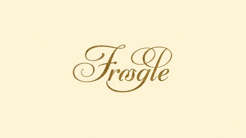
Garamond is a classic serif typeface from 16th-century France. It exudes elegance, tradition, and credibility. While known for print, modern digital versions are a sophisticated choice for formal or academic presentations.
Its graceful letterforms suggest gravitas and quality. This makes it ideal for high-end brands, academic conferences, or financial firms. Garamond brings a refined personality to your slides, making it a strong contender when you need the best font for a presentation that feels timeless.
Why it works
Garamond establishes immediate trust and authority. This is invaluable when presenting complex research or high-value propositions. It lends an inherent sense of craftsmanship and intellectual rigor to your content, signaling deep expertise.
How to use it
Using a serif on screen requires care. Its delicate strokes can be lost at small sizes, so size and spacing are critical.
- Headlines: Use a bold cut like Adobe Garamond Pro Bold at 40–46pt.
- Body Text: Maintain a minimum size of 24–28pt. It is often better to pair it with a sans-serif for body text.
- Line Spacing: Set leading to at least 1.6x the font size.
- Contrast: High contrast is essential. Use dark text on a light background.
What to consider
Garamond’s primary drawback is legibility at small sizes. Its thin strokes can appear fuzzy on low-resolution screens. Its traditional feel may also seem dated for a modern tech startup.
4. Calibri
Calibri is a sans-serif typeface designed by Lucas de Groot for Microsoft in 2004. It was engineered for on-screen clarity and became the default for Microsoft Office in 2007. Its soft, rounded corners give it a friendly and modern feel.
Its ubiquity in the corporate world makes it instantly familiar. It is a safe and dependable choice for your pitch deck. For many, Calibri is the visual language of business productivity.
Why it works
Calibri was designed for digital screens. It renders clearly on projectors, monitors, and laptops. Its slightly condensed letters allow more text to fit on a line without feeling cramped. It strikes a unique balance between professional and approachable, making your content feel accessible.
How to use it
Make Calibri shine by focusing on weight and spacing. Your design choices must be intentional to avoid a generic look.
- Headlines: Use Calibri Bold at 36–44pt for strong titles.
- Body Text: Keep body text between 18–24pt for readability.
- Line Spacing: Use a generous leading of 1.5x to 1.75x.
- Color: Pair its warm tone with a complementary color palette.
What to consider
Calibri’s status as a long-time Microsoft default can make it appear uninspired. It might not convey the innovative spirit of a disruptive tech company. Microsoft has since replaced it with Aptos, which can date older presentations.
5. Montserrat
Montserrat is a geometric sans-serif created in 2011. It was inspired by old signs in Buenos Aires. Available for free on Google Fonts, it offers a stylish, modern alternative to traditional sans-serifs.
Its clean, open feel is excellent for tech startups and creative agencies. The font balances professionalism with personality. This makes Montserrat one of the best font for presentation scenarios aimed at design-savvy audiences.
Play videoThe 8 best fonts for your presentation in 2025 videoThis loads content from YouTube.
Why it works
Montserrat has an extensive family of weights, from Thin to Black. This gives you great versatility for creating visual hierarchy. Its friendly yet professional character is perfect for pitches that need to be both authoritative and approachable.
Its open-source availability makes it a highly accessible tool. Founders can create a sophisticated typography system without licensing costs.
How to use it
Leverage its different weights to build contrast and guide the viewer’s eye.
- Headlines: Use Montserrat Bold or Black at 40–48pt for impact.
- Body Text: Choose Montserrat Regular or Light at 18–22pt.
- Line Spacing: A leading of 1.4x to 1.6x enhances readability.
- Pairing: It pairs well with modern serifs like Merriweather.
What to consider
Montserrat has become very popular, so it risks feeling overused. It may not stand out as a unique brand element. Its geometric style might not suit every brand’s aesthetic, particularly those aiming for a more classic feel.
6. Lato
Lato is a sans-serif typeface designed in 2010. Its name means "summer" in Polish, reflecting its warm, friendly character. Lato balances classic proportions with a clean structure, creating a feeling of stability and warmth.
This combination of professional and friendly makes it a standout choice. It feels familiar without being generic. This makes it an excellent font for presentations in tech, education, and startups.
Why it works
Lato was designed for on-screen legibility. At larger sizes, its semi-rounded details give headlines a friendly feel. At smaller sizes, these details are less noticeable, so the font reads cleanly. Its warm and approachable nature builds an immediate sense of trust. It makes complex data feel more accessible.
How to use it
Lato’s extensive family of weights provides all the tools needed for strong visual hierarchy. You can download it from Google Fonts.
- Headlines: Use Lato Bold (700) or Black (900) at 42–48pt.
- Body Text: Lato Regular (400) at 18–22pt ensures readability.
- Line Spacing: Set leading to 1.6x to 1.8x for text-heavy slides.
- Pairing: Pair it with a serif like Merriweather for contrast.
What to consider
Lato’s widespread use means it may not feel unique enough for exclusive brands. Its friendly demeanor might be less suitable for extremely formal corporate settings, where a font like Helvetica would be more appropriate.
7. Segoe UI
Segoe UI is a sans-serif typeface from Microsoft, developed in 2004 for user interface legibility. It has been the native system font for Windows since Vista. Its design prioritizes clarity and accessibility over strong personality.
Its connection to the Windows ecosystem makes it a reliable option for corporate presentations. It feels natural to audiences accustomed to Microsoft products. This is a solid candidate for the best font for presentation when your delivery platform is Windows-based.
Why it works
Segoe UI was designed for screens. It is exceptionally clear on projectors and monitors. Its open letterforms and generous spacing prevent characters from blurring together. Its system-native status on Windows guarantees seamless rendering and consistency. You avoid font errors that can derail a presentation.
How to use it
Use its extensive family of weights to establish a clear visual hierarchy. Its clean design works best with structured layouts and ample white space.
- Headlines: Use Segoe UI Semibold or Bold at 40–48pt.
- Body Text: Choose Segoe UI Regular at 20–24pt.
- Line Spacing: A leading of 1.4x to 1.6x enhances scannability.
- Emphasis: Use Semilight or Italic for captions.
What to consider
Segoe UI’s strong association with Microsoft can make presentations feel generic. It is not pre-installed on macOS, leading to rendering issues on Apple devices. For cross-platform compatibility, Arial or Helvetica might be safer.
8. Roboto
Roboto is a sans-serif typeface from Google, released in 2011 for its Android OS. It has a mechanical skeleton with friendly, open curves. This makes it an exceptionally good font for presentation design that needs to be modern, tech-forward, and readable.
As an open-source font, its accessibility has made it a go-to choice. For founders in tech or software, Roboto signals a brand that is current and clean. It’s a familiar choice for audiences accustomed to Google’s products.
Why it works
Roboto was designed for high-resolution screens. Its letterforms render crisply without distortion. This ensures your text is legible on a 4K projector or a smartphone. It strikes a perfect balance between professional and approachable. Its subtle warmth feels human, ideal for tech companies that want to project both innovation and user-friendliness.
How to use it
Roboto’s extensive family of weights gives you flexibility for building visual hierarchy. It is one of the best font for presentation decks aimed at a tech-savvy audience.
- Headlines: Use Roboto Bold (700) or Medium (500) at 42–48pt.
- Body Text: Choose Roboto Regular (400) at 18–22pt.
- Line Spacing: Use a leading of 1.4x to 1.6x.
- Pairing: Roboto works best as the sole typeface in a presentation.
What to consider
Because of its association with Google, Roboto can feel too "tech-specific" for other industries. Its ubiquity in tech means it may not stand out in a sea of similar-looking startup pitch decks.
Presentation font comparison table
Here’s a quick asset to help you choose. This table breaks down the key features of each font. Use it as a checklist to find the best fit for your next deck.
| Typeface | Best For | Tone | Key Feature |
|---|---|---|---|
| Helvetica | Investor & corporate decks | Neutral, Professional | Timeless clarity |
| Arial | Internal & data-heavy decks | Straightforward, Safe | Universal compatibility |
| Garamond | Academic & luxury brands | Elegant, Traditional | Authority & sophistication |
| Calibri | Standard business decks | Friendly, Modern | Approachable readability |
| Montserrat | Startup & creative pitches | Stylish, Geometric | Versatile weights |
| Lato | Tech & digital-first brands | Warm, Accessible | Trust-building personality |
| Segoe UI | Enterprise & Windows decks | Clear, Unobtrusive | Optimized for screens |
| Roboto | SaaS & tech product decks | Modern, Clean | Tech-forward aesthetic |
Your font is part of your story
Choosing the best font is a strategic decision. Your typography sets the tone for your message before you say a word. The right font builds trust, enhances clarity, and reinforces your brand.
Think of your font as the framework for your content. It guides the reader’s eye and turns a dense slide into a clear insight. Your task is to select the font that best aligns with your company’s story, your presentation’s context, and your audience.
- Clarity over cleverness. Your primary goal is communication. Sans-serifs like Montserrat and Segoe UI often win for screen presentations because they prioritize legibility.
- Context is king. The best font for a VC pitch might not be the best for an all-hands meeting. Consider who you are speaking to.
- Consistency builds credibility. Stick with your chosen fonts. This creates a cohesive, professional brand identity and signals attention to detail.
Use this simple checklist for your next presentation:
- Define your brand’s personality. Are you innovative or reliable?
- Test for legibility. Can you easily read your smallest text from a distance?
- Check font pairings. Does your header font contrast well with your body font?
- Confirm availability. Ensure your font is universal or embeddable to avoid issues.
The best font for a presentation becomes invisible. It allows your ideas, data, and story to shine. It supports your narrative and helps you move one step closer to your goal.
Getting the font right is a critical first step. But a winning pitch deck combines a strong narrative, compelling data, and world-class design. If you need help turning your vision into a deck that gets funded, the team at Pitchili can help. We craft investor-ready presentations that make your story impossible to ignore.
